
A few weeks ago, I shared why graphics are really rather important when it comes to your blogs look and it's brand, and dished the dirt on how I create some of my graphics with Picmonkey, with a promise to share how I create my other graphics, those created on Canva. This is that promise my friends, and you definitely do not want to miss it. If you thought how I created my Picmonkey graphics was easy, wait until you check out Canva..
So, What's the Deal With Canva?
Well, much like Picmonkey, Canva is a free design resource, with the ability to buy extra features, but there is where the similarities tend to end. Unlike Picmonkey, Canva has over 40 different types of template size, all for different purposes, anything from the perfectly size Twitter Header, to Menu templates, to Blog Graphics (I know!). Within those different options, there are what feels like a never ending collection of actual design templates for you to try out and play around it, (although it's worth baring in mind that not all of those templates are free to use, so do be careful). You can choose from close to 1,000,000 (yes, a million people, it's worth counting the zeroes just to check) images and over 1000 different fonts, with clip art, icons, vectors and more available just be searching for it. Drag and drop, edit and upload, Canva is fabulous. Here's how I use it.
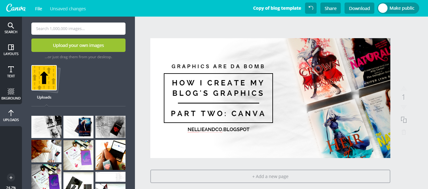
1. Firstly, I Check Out All My Options, Then Choose 'Twitter Post'
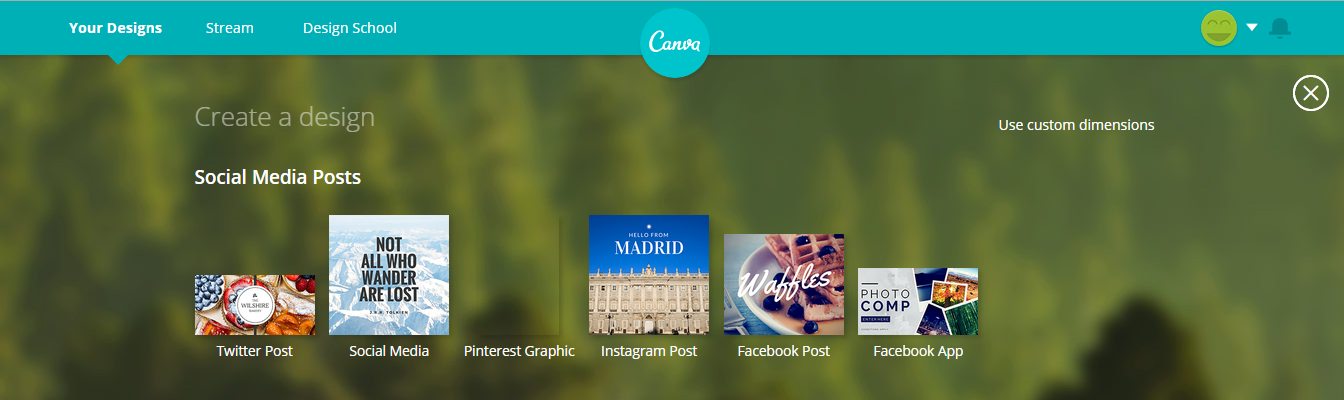
I could say that I choose 'Twitter Post' because is the social media site I use most and promote the most on, or I could say it's because I tried them all and found it was the best fit for me, but honestly, I used it once and loved it (so of course, it's the only option I really use, typical Brit over here!) From that point onwards, I'm met with a blank slate of nothingness and lots of options in the sidebar. Do not panic, most people when they use Canva for the first time don't even know what most of the options do, and today, we're not going into too much detail with them either - that's something you can do in your own time. Once the panics over, I scroll through the template options on the left until I find a very attractive one of with bokchoy on it. Oh yum..
2. Then, It's Time to Ditch The Veg and Keep The Style
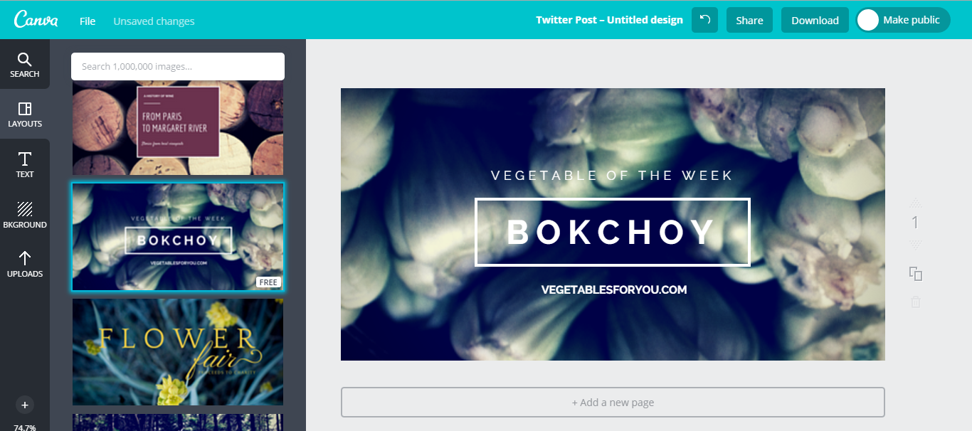
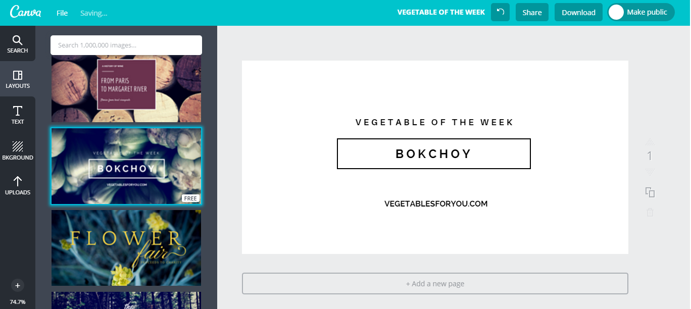
Getting rid of features about the template you don't like and switching up those you do want is one of the best things about Canva. You can add as much as you, or take it away, and my favourite thing about this template how the title, subtitle and website name are all ready to go - which mean the spouts are being kicked out. Simply click on the image of the bokchoy and choose the little bin icon. Before getting rid of the second background (spot the sheep, I dare you!) I usually switch the font colour from white to black, just so I can see everything when I do delete the second background. Once edited and deleted, I'm left with a slightly less blank, yet great slate to work from.
3. Next, I Play Around With the Fonts and Their Size
One of the important things when creating graphics is to keep the style very similar to your blogs look, so when they're on your blog, they look great, and when they're out of context and off your blog, they still look like they belong to you (because let's face it, they do!) When I first started out on Canva, I play around for a long time looking for the right fonts and the right styles, and in the end, I went with Raleway and Aileron Regular, as these are the fonts I think blend in well with the rest of my design. Interestingly, my Canva graphics are the only place on the entirety of my blog that I use black. I tried using grey in them at a later date but found I'd fallen for the look, so left it be. After some switching up fonts, playing with their sizes, and positioning them where I want them, I'm almost ready for the final flourish.
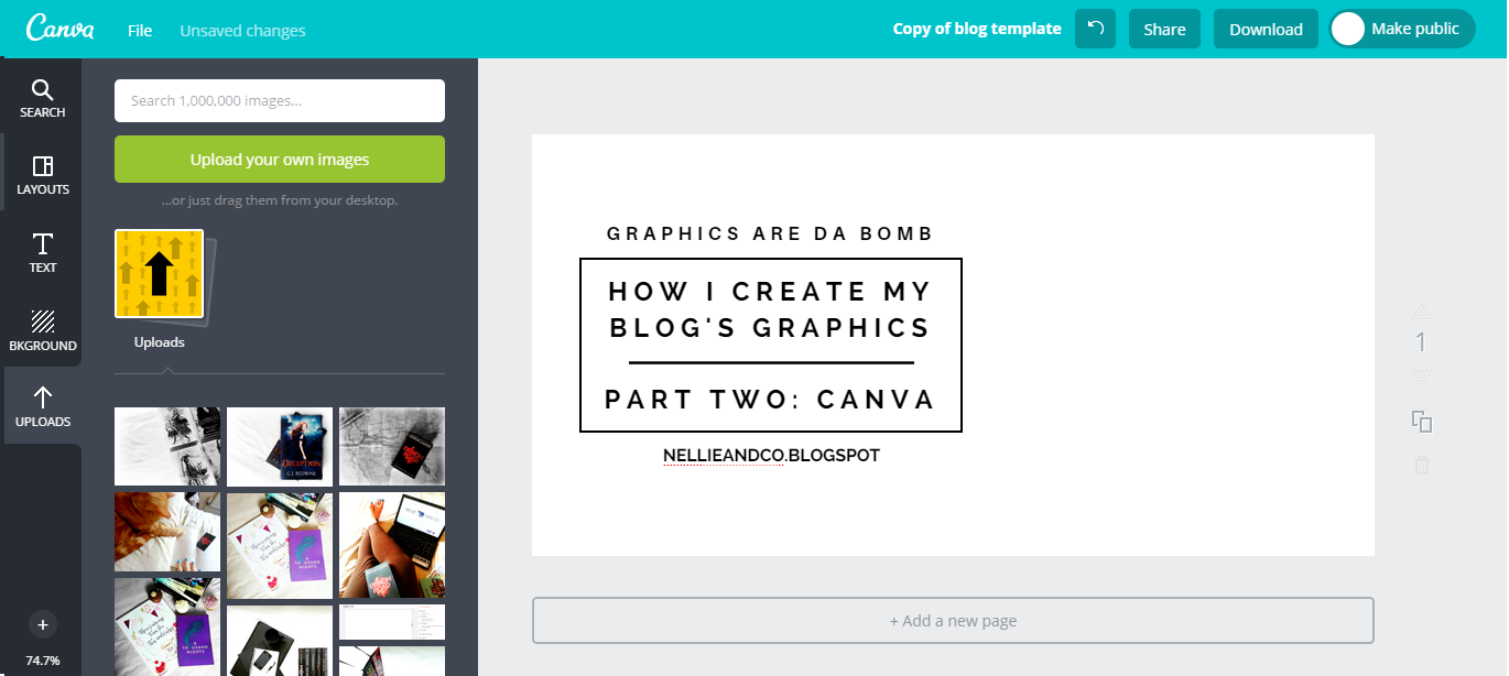
4. Insert Pretty Picture, and You're Ready To Roll
The best step is always the step when things go from bland to boom is a few seconds, and this is that step people. Go into uploads in the left sidebar, click upload images and elect your image. Once uploaded, simply drag onto the canvas, resize and tadah, graphic complete! Everybody does this step differently, and I know I personally have seen it done a lot of different ways. Most commonly known is Paper Fury's graphics, most, if not all created on Canva, using a full image background, and they do look super cool. I personally go for the white background, sometimes with a hint of grey, or sometimes a completely grey background in order to keep in with my style and brand. I tend to put my images through an intense editing session before I upload them in order to make the colours pop and get the background as white around the edges as possible, as most of my image are smaller than the actual background available to fill, allowing me to have my image as some of the background, and a plain background as the rest.
It Gets Better.. Canva Saves Your Projects. No Need To Start a Fresh!
In a much better way than Picmonkey, Canva actually saves your projects as your creating them, which is not only great if you accidently close your tab (which I do all the time) but is great in that when you're next on Canva, they will show you your most recent project. From there, you can either: open that project and make changes, recreating a new graphic with your personal template, or, copy your project and then recreate a new project from the template, all the while keeping the original. Creating Canva graphics take me all but a few minutes. I add my text, move it around, add an image, graphic complete - in fact, editing the image for the graphic takes longer than actually creating the graphic itself. Pretty impressive, don't you think?
Simple. Good Looking. Quick to Create. Canva is my Best Friend!


0 Komentar untuk "How I Create My Blog's Graphics | Part Two: Canva"