You've seen the new craze hitting the streets, the content upgrade advice, the 'grow your email' shouts that come with it, and yes, content upgrades can benefit your blog hugely, and they help grow your email list, but if you're anything like me, you're wondering 'how the heck do I do that Amanda?!'
The answer is simple my friend. Canva.
I've talked about my dear friend Canva before when I showed you how I create some of my blog graphics, but just when I thought this insane free resource couldn't get any better, it went and proved me wrong.
Most professionals you see creating content upgrades; worksheets, workbooks, planners and so on have one tool I, and you, most likely do not - Photoshop and Illustrator. I thought that because I didn't have these tools, I couldn't create something fabulous like that myself, but once I stopped wallowing and put on my big girl panties, I started looking for ways I could.
Enter Canva.
Canva not only allows you to create beautiful graphics for your blog, but it also enables you to create PDF documents, or at least download them for use either online or for printing. You can create any extra bonus document, worksheet, full-on workbooks for your blog to use as content upgrades and extras, and it never gets any more complicated than simply using Canva as you already do.
Don't believe me? Here's a real-life example.

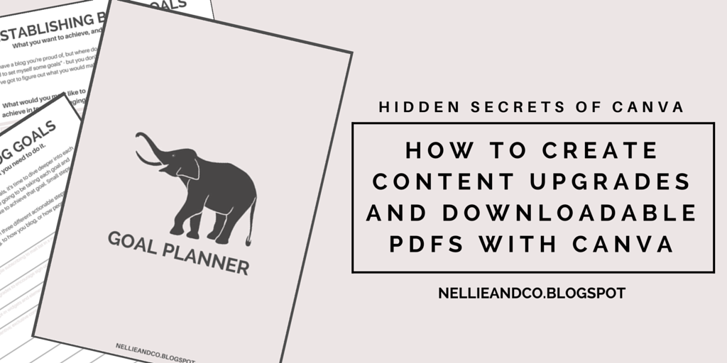
Check out my Goal Planner, created using Canva, using simple drag and drop features Canva is known for. It's ease of use and ready-made templates make it a doddle to use, and creating PDF documents for your blog is really not as difficult as it seems. I'm going to show you how I created mine, and how easily you can create your own too.
I started off opening Canva and choosing an A4 size document. Choosing A4 was important for a number of reasons, the main one being that when it's printed out by myself or others, the content will actually fit perfectly on the paper rather than need to be moved, remastered or altered, a win win for everyone involved. Then I got to work on creating the pages.
At this point, I decided I wanted to stick with a simple design, something that followed my current design and carried my brand and style with it, so grey scale was the easiest of options. By choosing not to include to any actual colours in the planner too, it won't loose it's style or it's quality of printed out in black and white, which is in some cases, the easiest and cheapest option for people, including myself.
One of the important things when creating a PDF document or workbook in Canva is to have some sort of idea on what the pages will look like, what you want each page to cover, and how other users will work their way through the document you're creating. Important things to consider consist of space in which to write things in, the size of the font so you'll be able to read it once it's printed, the shades of colours you use and how they may look printed out in different colours and in black and white, and the font choices you make.
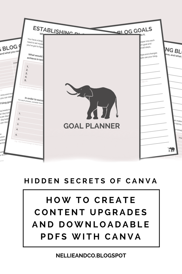
Go Ahead, Hover Over and Pin It!
Let's take a look at the difference between pages 2 and 3 and how I created those in Canva.
The making of Page 2
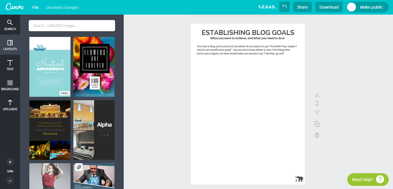
Page 2 was all about getting your goals down on paper, as simple as they may have been, quickly establishing something they may help you on your way to succeeding, and how easy it will be in terms of money, time and getting help. Page 2 is about being able to quickly look at your goals and remind yourself of what you want to achieve and how close you are to getting it done.
Creating Page 2 was more complicated than I had originally expected, however, once you're on a roll, it's rather easy and simple. With the new A4 document open, I moved onto the Text option and added in my page title, description and a short paragraph, taking into my brand colours and the size of the font. I then moved onto upload and uploaded my logo and added it to the right-hand, bottom corner with a page number to add that extra level of detail and bring my brand into my product.
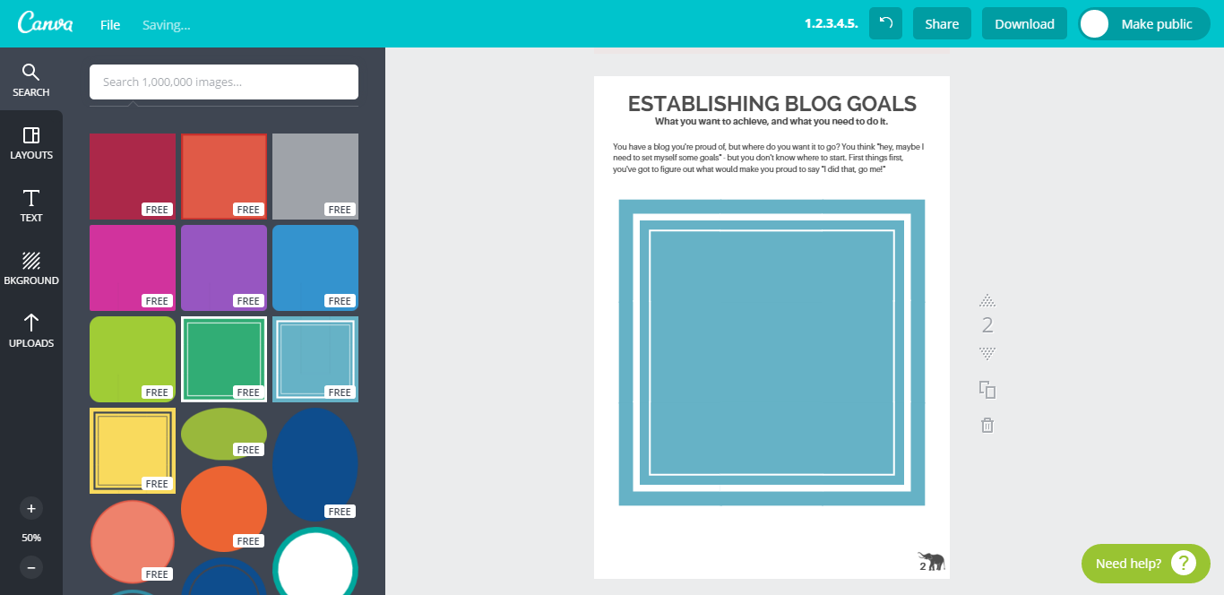
Moving onto the actual content areas, I knew I wanted to split my page into three defined sections, two small, one large, so with Canva's leveling feature, I chose my rectangle shape from their collection by going into Search, Shapes and choosing the style that most appealed. As you can see, you can easily change the colour of the box and edit it to match your colour scheme, and once that was done, I created two other grey box text areas. The third text box involved adding line to great the table look, which was done by going back to Search and going into Line and choosing the first option. With some resizing, I was left with this look.
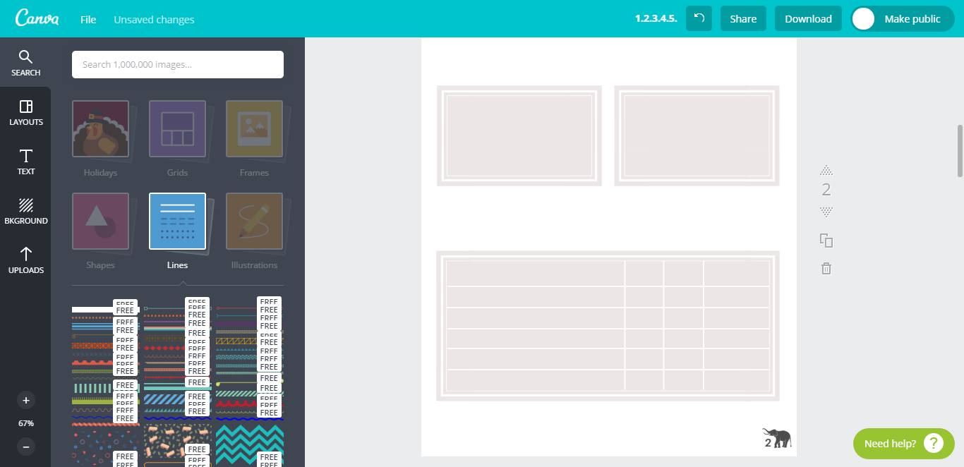
With the basics boxes all sorted, it was about adding the rest of the written content, the titles, and questions and anything else the page called to have. Once this was all completed, I focused on making sure my text areas where level, in line and the right size, and so by pressing the left mouse button and dragging my cursor over the area, I was able to highlight and move an entre text area, box and text included, and use the line levels included in Canva to keep my page in balance.
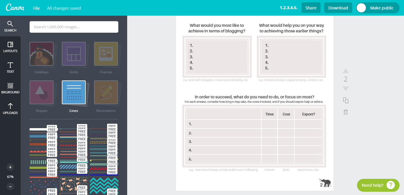
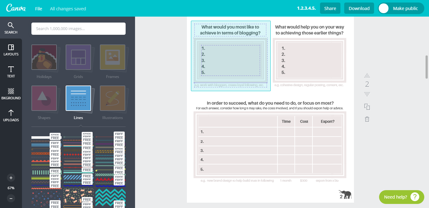
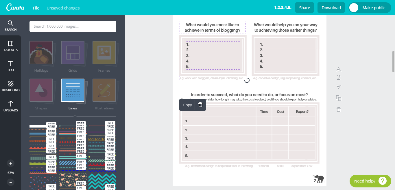
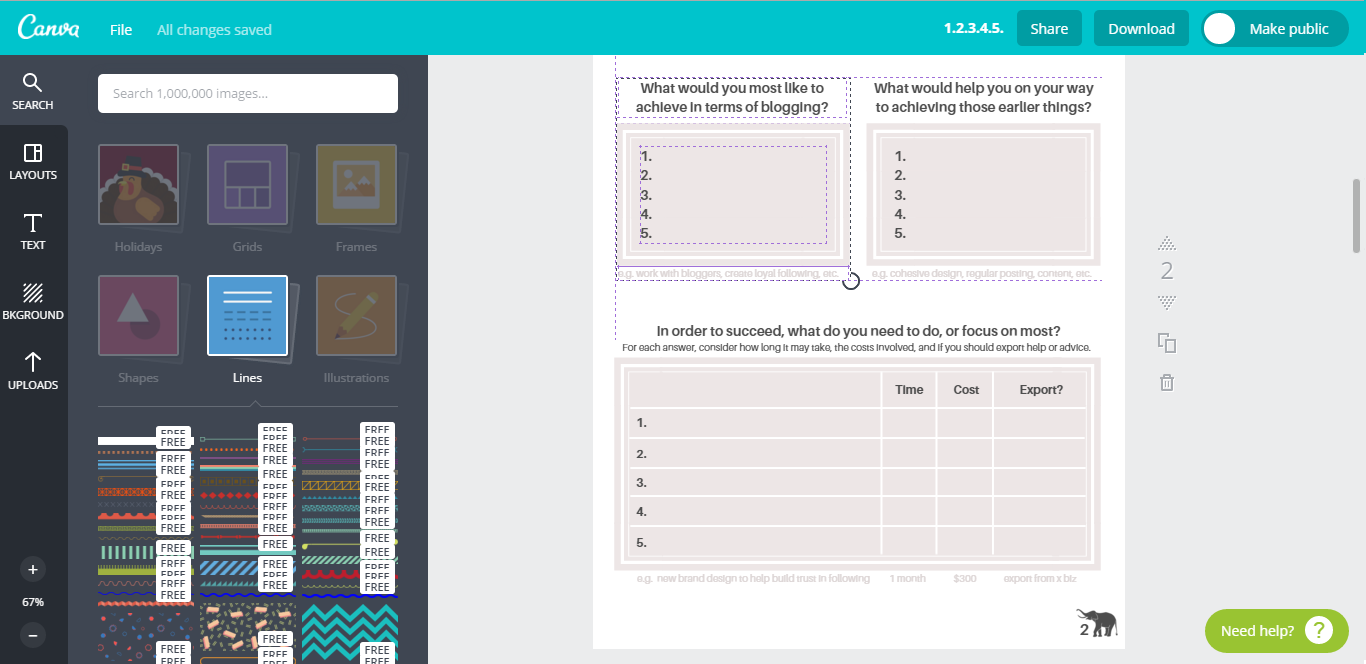
Once I was happy with the look, I made sure my project so far had saved.
The making of Page 3
Page 3 was all about diving deeper into each goal, and looking at the steps needed to take to get there. If your goal were a cake, the steps are the ingredients, what needs to be in place for the cake to bake, sort of speak. In order to keep the same format and layout, I copied Page 2 in order to save adding the title and description again, ensuring they would be identical. Once again, I then highlighted everything I didn't want and deleted it to create a clean page to work with. I then added in a new paragraph for this page too.
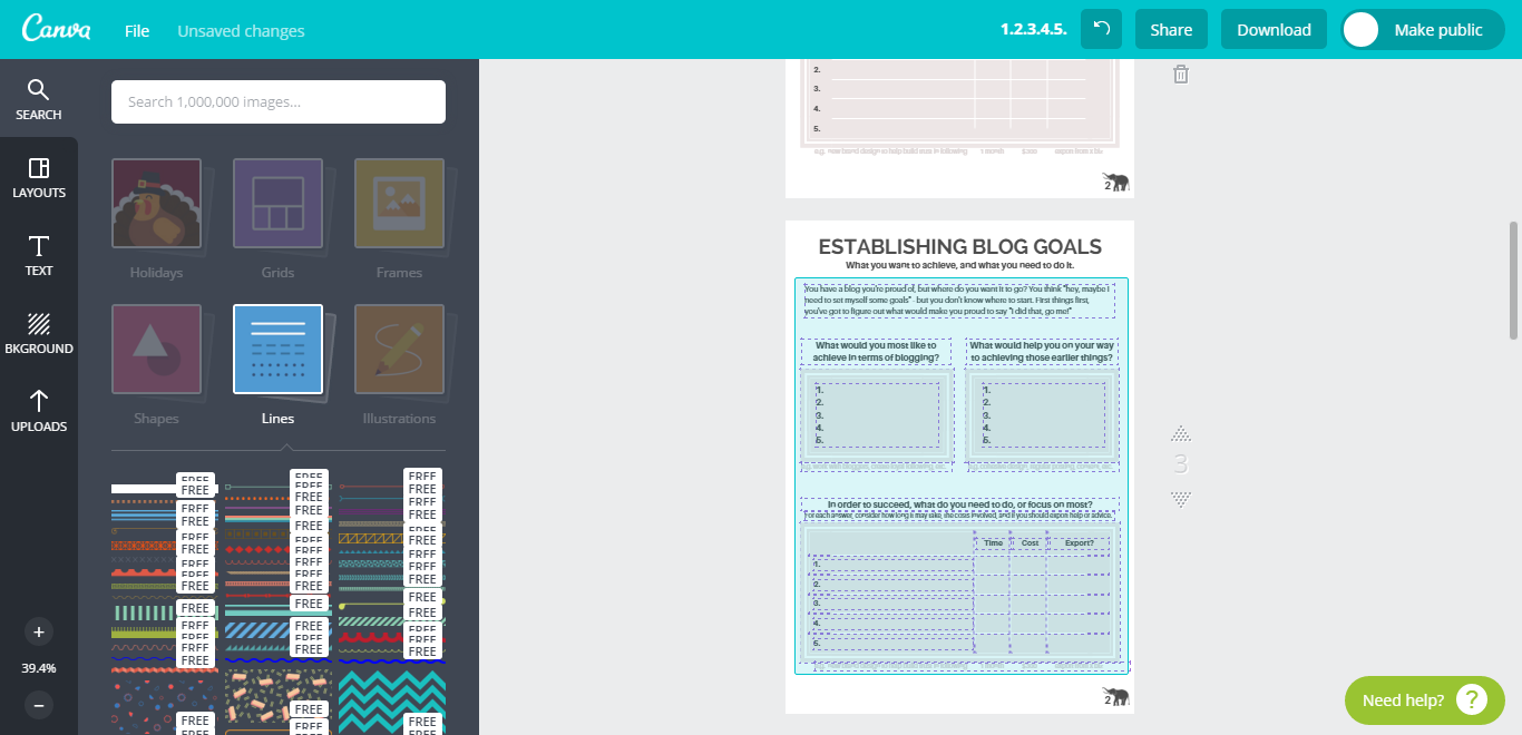
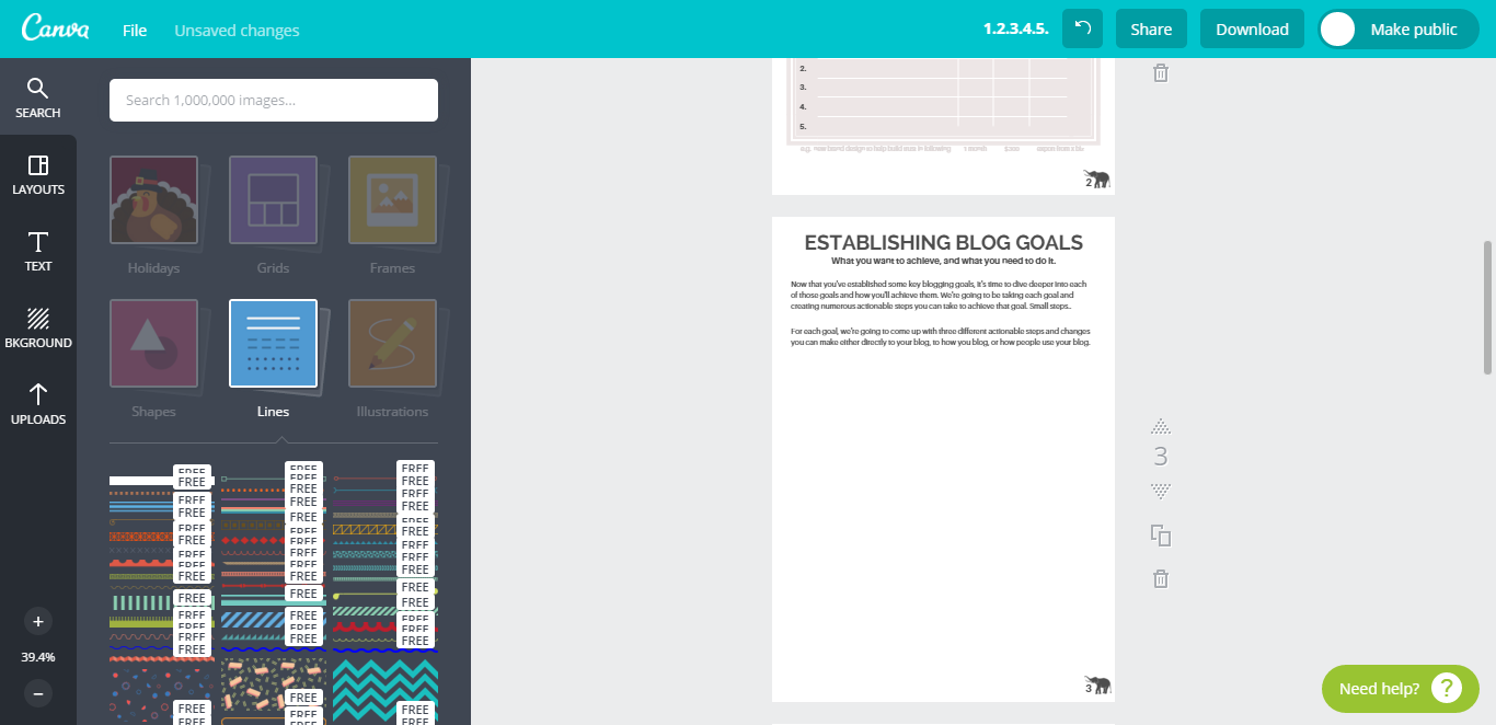
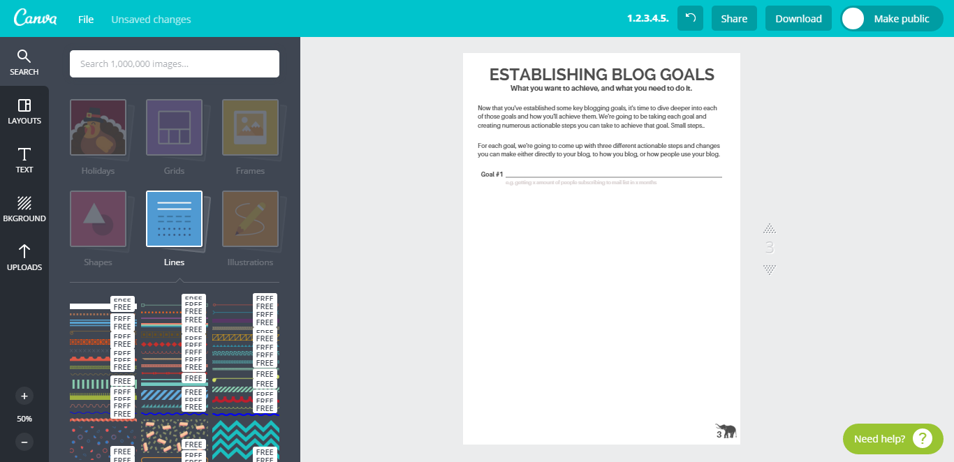
Creating the lined sections for Page 3 and the following page were much easier once I'd discovered the lines for the previous page, so all this page involved was adding a line, resizing and re-colouring, some text and aligning it all on one line so somebody's written text followed the text before the line, such as Goal #1. What followed was simply highlighting the section, copying it and repeating it for both page 3 nand page 4.
Once you're completely happy with your project, and you come to downloading it, make sure you download through the option PDF: For Print as the quality is much higher and it is perfect for when you're extra content is printable and usable physically.
If you thought creating those pages was easy as anything and requires no time at all, you should check out my next project with Canva, an awesome 2016 Blog Planner, spanning the next year with both Weekly and Monthly pages, month title pages, pages for you to add your goals, statistics, brain-storming areas, contact and address book area, and so much more! It's been so easy to create PDF documents with Canva, and I really would never have made the leap without it.
There are however, as with everything, a few drawbacks. One of those drawbacks is that each project can only contain a maximum of 30 pages, which means if, like me, you're creating a huge project with waaaaaaaay more than 30 pages, there's going to be a point were you need to split it into numerous parts. Personally, I'm splitting my Blog Planner into a variety of different projects with will allow a decision on what pages you want to be entirely up to you. Besides that drawback, the freedom of creating PDF's without the use of Adobe definitely out-weight the issue for me, and I plan on creating many many more projects in the future with this super handy feature.
P.S. If you're looking at the Goal Planner and thinking 'I want that Goal Planner!', hold your horses my friend, it's coming next month, and it's 100%, totally free, no sign-up or email required. I know, you can't wait, but you'll have to, and for that, I'm sorry! Still, if you're excited, so am I..
Do you use Canva already? Would you use it for PDFs?

Psst, you can also use Canva to create blog graphics! See how now! >>


0 Komentar untuk "How To Create Content Upgrades and PDFs with Canva"